
Dutch National Opera & Ballet launches new brand identity
Alongside the presentation of the 2024/25 season, we are proud and delighted to introduce our new brand identity.
Why did we decide to refresh our brand identity?
The rebranding was motivated by a desire to make our mission – to enrich the lives of as many people as possible through opera and ballet – resonate with audiences on a deeper level in words and visuals, whether they are seasoned theatregoers or newcomers.
Aesthetics and expression lie at the heart of everything we do, which we wanted to see reflected in our visual identity. And so, we set out to define our new brand strategy with the help of creative collective Total Design.
Kate Harriman, Head of Marketing at Dutch National Opera & Ballet, explains: ‘Our visual identity is based on a strategic brand promise that captures the essence of how opera and ballet affect audiences. We defined this emotional resonance as feeling “united in something greater than yourself”. At Dutch National Opera & Ballet, we give theatregoers a break from reality and let them step into a world that transcends the everyday. The connection between creators, performers, the orchestra and the audience is unparalleled. Opera and ballet speak the language of the soul, a language that makes us feel connected. The emotional journey our audiences experience is mirrored in our new brand identity.’
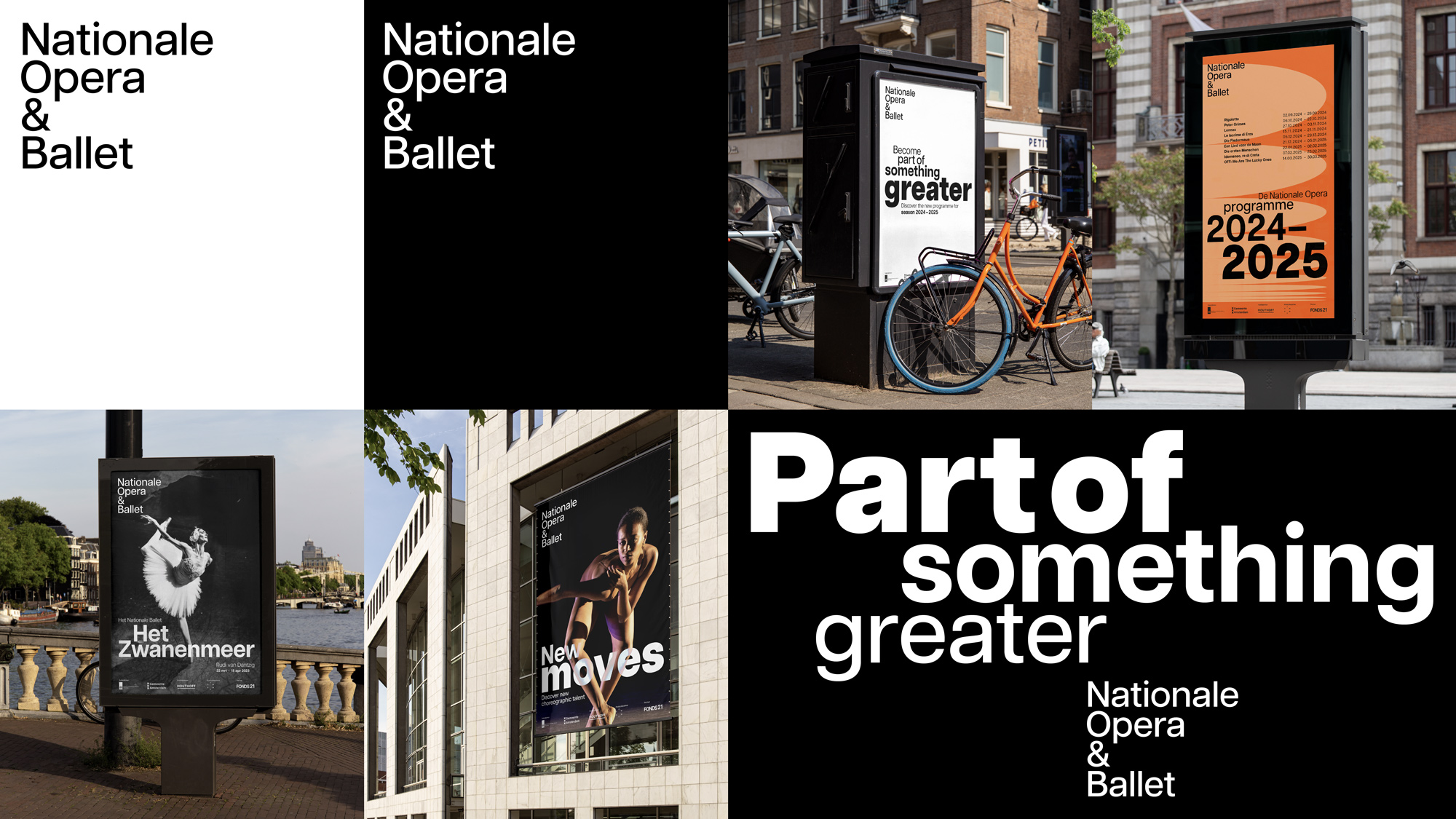
A monolithic brand with a single identity
Rather than operating three brands as we did before, we now have a brand identity that truly positions Dutch National Opera & Ballet as a single, unified production house. Going forward, we will refer to ourselves as Dutch National Opera & Ballet in all our communications. That said, we will continue to distinguish between opera and ballet as two art forms in our messages.
Composition and visual arrangement
The new brand architecture and identity were developed based on the brand promise ‘united in something greater than yourself’. The design starts from this brand promise and portrays an upward and transcendent movement, creating a choreography of typography, imagery and visual arrangement. The composition is meant to captivate and mesmerise the intended audience.
The choreography of typography lends imagination to the words. The layout and visual arrangement create a composition that, besides expressing what we want to say, also conveys our words with impact. The placement, font size and text styling visualise the emotional journey, with or without visuals to illustrate the experience.
Motion design emphasises the upward movement, the feeling of being part of something greater than yourself. The dynamics of the logo, text and graphics give the brand freedom of movement. A flexible grid sets the stage for perfect execution and ensures consistency.
The logo was reduced to its essence. Being a wordmark, the logo evokes a sense of openness and approachability. Because the logo is left-aligned and vertically stacked, it will always read ‘NO&B’ from top to bottom, drawing the attention to the two art forms: opera and ballet. Simplicity is the hallmark of perfection. In combination with the upward motion design, this helps to reinforce the brand promise.
Digital-first
At Dutch National Opera & Ballet, we mostly use digital platforms for our communications and ticket sales. That is why, in the design, we incorporated a digital-first strategy from the very start, also focusing on evaluating and improving the user experience.
New brand identity Dutch National Opera & Ballet


